Field overload
Too many fields on one screen left users confused and overwhelmed.
A ground-up redesign of the NYPD's internal forms experience—turning busy, exhausting screens into calm, adaptive workflows.
00 / The project
The internal application supported officers, administrative staff, dispatch operators, and investigators in their daily work. Over time, clutter and complexity drove completion down and frustration up.
Make every form faster, clearer, and easier to complete—for everyone.
01 / UX audit
The review exposed a system that asked users to carry the burden of its complexity.
Too many fields on one screen left users confused and overwhelmed.
Weak hierarchy made important fields easy to miss.
The same data had to be entered multiple times.
Long forms pushed users to abandon work before completion.
Technical wording made questions difficult to understand.
Users could not tell how far they had left to go.
Every form forced users to relearn the interface.
02 / Research synthesis
Interviews, contextual observation, step-by-step walkthroughs, and existing feedback all pointed to one insight: a single fixed form could not serve every user equally well.
Speed with minimal distraction
Accurate, structured entry
Short, direct inputs
Detail and easy reference
Guidance without training
High-volume efficiency
Defining insight
The form needed to adapt to the person, the task, and the moment—not the other way around.
The interface shift
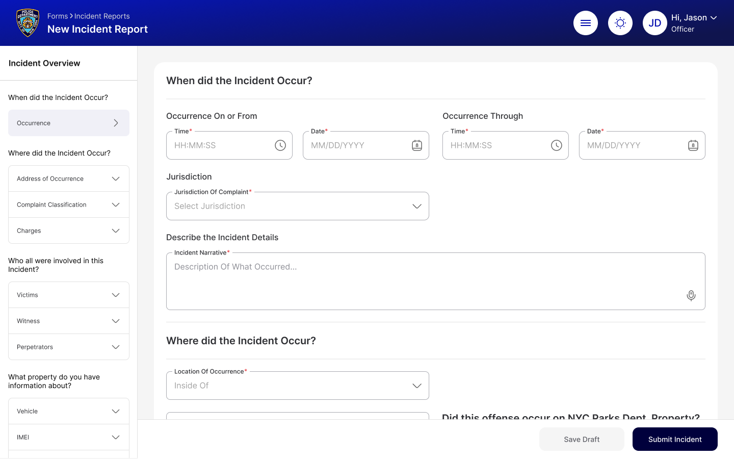
Redesigned experience
Progressive disclosure, smart defaults, contextual guidance, and persistent progress.
03 / Redesign
Evidence before assumptions. Structure before decoration. Confidence at every step.
Stakeholder interviews, workflow study, pain-point documentation, and journey mapping.
Usability, accessibility, form complexity, and interaction consistency evaluation.
User interviews, task analysis, observation, and early usability testing.
Modular structure, adaptive interactions, clearer visuals, and guided completion paths.
Solutions at a glance
Each intervention maps directly to a failure uncovered in research.
04 / Expected outcomes
More completed forms
Faster submissions
Lower mental effort
Fewer errors
Accessible by design
Greater operational efficiency